This is now deprecated and under maintenance for existing users only - no new customers can sign up for the platform plan
import { CalendarSettings } from "@calcom/atoms";

export default function CalendarSettingsComponent() {
  return (
    <>
      <CalendarSettings />
    </>
  )
}
| Name | Required | Description |
|---|
| classNames | No | To pass in custom classnames from outside for styling the atom |
| Name | Description |
|---|
| calendarSettingsCustomClassnames | Adds styling to the entire calendar settings atom |
| destinationCalendarSettingsCustomClassnames | Adds styling only to the destination calendar container |
| selectedCalendarSettingsCustomClassnames | Adds styling only to the selected calendar container |
| selectedCalendarSettingsClassNames | An object for granular styling of selected calendars component (see detailed table below) |
| destinationCalendarSettingsClassNames | An object for granular styling of destination calendar component (see detailed table below) |
selectedCalendarSettingsClassNames Object Structure
The selectedCalendarSettingsClassNames prop accepts an object with the following nested structure for granular styling of the selected calendars component:
| Property Path | Description |
|---|
container | Styles the main container of the selected calendars section |
header.container | Styles the header container |
header.title | Styles the header title |
header.description | Styles the header description |
selectedCalendarsListClassNames.container | Styles the container that holds all selected calendar items |
selectedCalendarsListClassNames.selectedCalendar.container | Styles each individual calendar item container |
selectedCalendarsListClassNames.selectedCalendar.header.container | Styles the header section of each calendar item |
selectedCalendarsListClassNames.selectedCalendar.header.title | Styles the title of each calendar item |
selectedCalendarsListClassNames.selectedCalendar.header.description | Styles the description of each calendar item |
selectedCalendarsListClassNames.selectedCalendar.body.container | Styles the body section of each calendar item |
selectedCalendarsListClassNames.selectedCalendar.body.description | Styles the body description of each calendar item |
noSelectedCalendarsMessage | Styles the message shown when no calendars are connected |
destinationCalendarSettingsClassNames Object Structure
The destinationCalendarSettingsClassNames prop accepts an object with the following nested structure for granular styling of the destination calendar component:
| Property Path | Description |
|---|
container | Styles the main container of the destination calendar section |
header.title | Styles the header title text |
header.description | Styles the header description text |
import { DestinationCalendarSettings } from "@calcom/atoms";

export default function DestinationCalendars() {
  const loadingStatus = <>Loading...</>

  return (
    <>
      <DestinationCalendarSettings classNames="mx-5" statusLoader={loadingStatus} />
    </>
  )
}
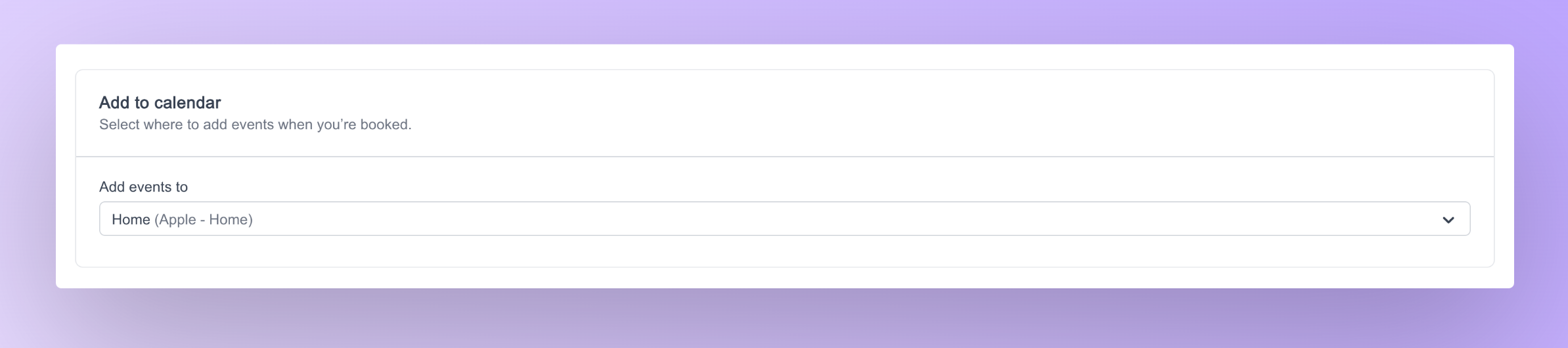 Customizations can be done to the destination calendar settings atom via props. Below is a list of props that can be passed to the calendar settings atom
| Name | Required | Description |
|---|
| statusLoader | No | To pass in a custom component for the loading state |
| classNames | No | To pass in custom classnames from outside for styling the atom |
import { SelectedCalendarsSettings } from "@calcom/atoms";

export default function SelectedCalendars( props : SelectedCalendarsProps ) {
  return (
    <>
      <SelectedCalendarsSettings classNames="mx-5 mb-6" />
    </>
  )
}
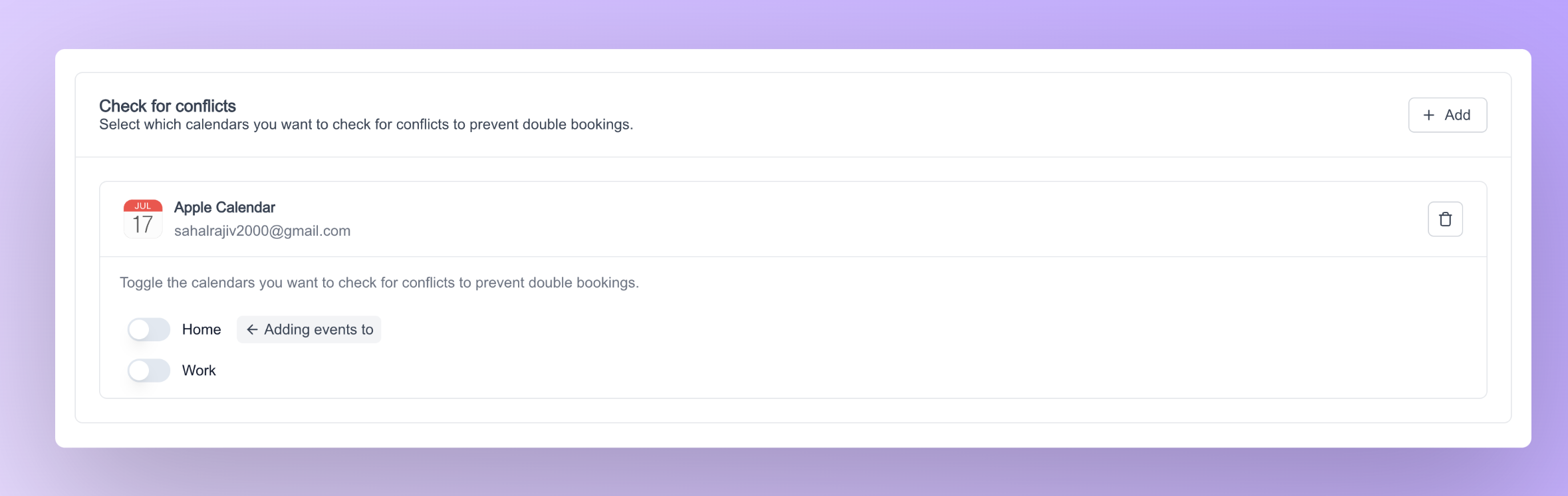 Customizations can be done to the destination calendar settings atom via props. Below is a list of props that can be passed to the calendar settings atom
| Name | Required | Description |
|---|
| classNames | No | To pass in custom classnames from outside for styling the atom |

